Table of Contents
Focal Elements and Emphasis
Focal Elements and Emphasis dictates the rough order in which the eye looks at the different elements of the artwork. This doesn’t just apply to static renders, but composition can also be achieved in games and even outside of cutscenes.
Great composition is achieved through:
- Color, Saturation and Contrast
- Placement of Key Elements
- Negative Space
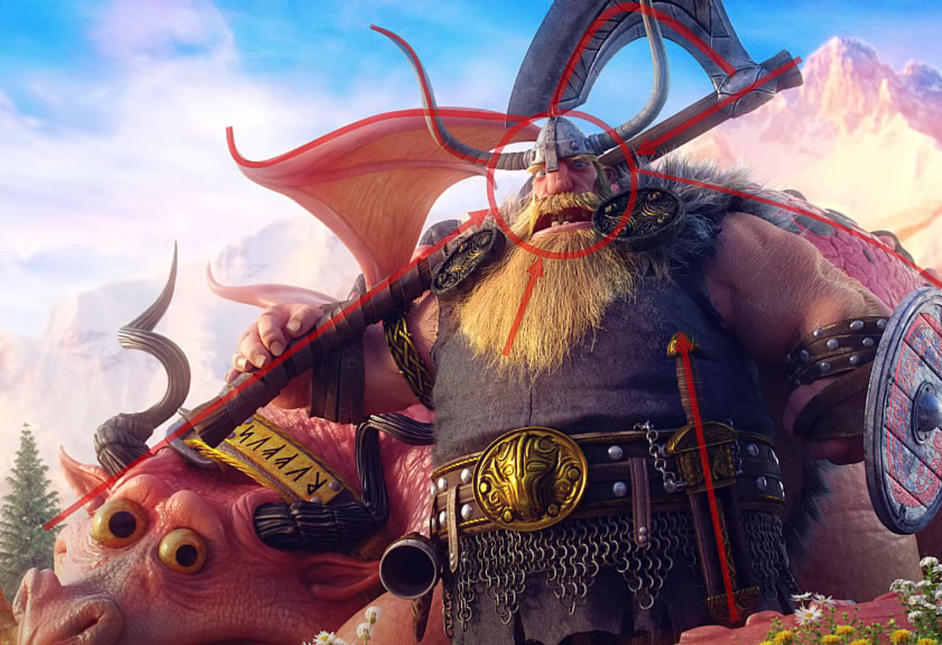
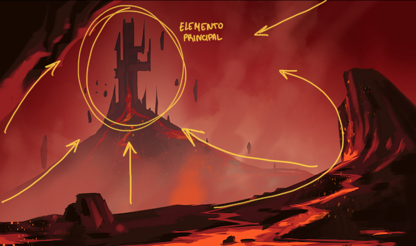
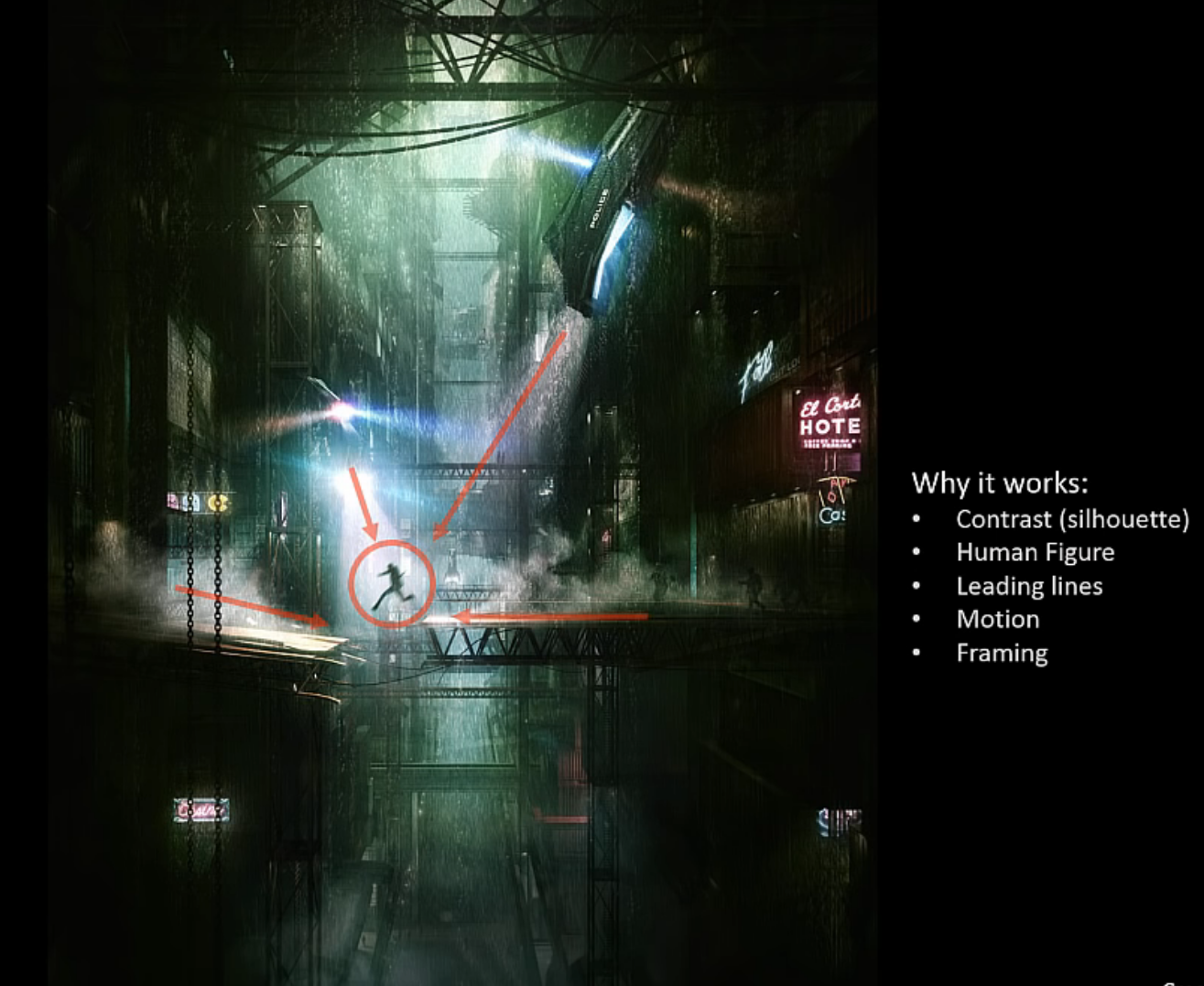
- Energy Lines
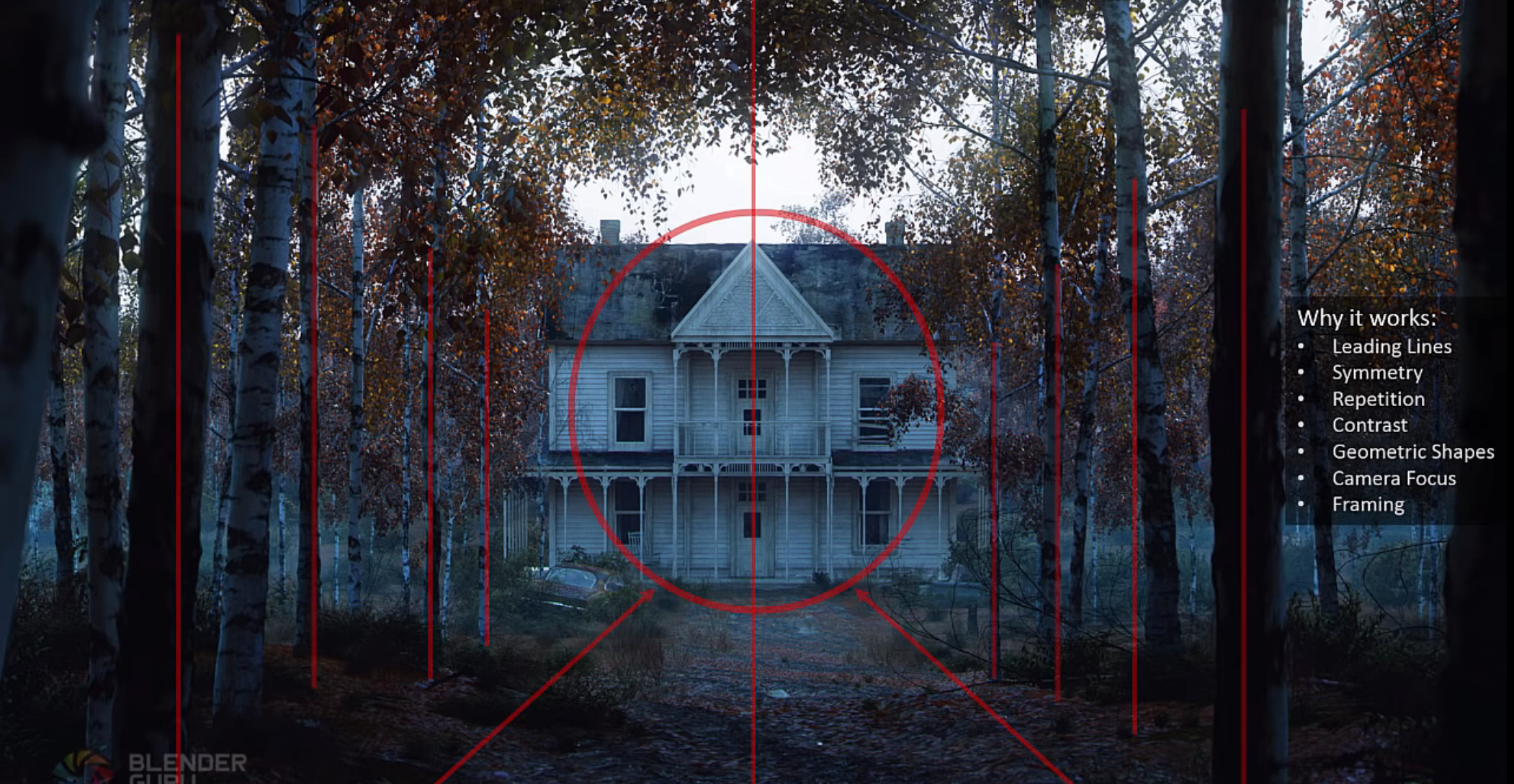
- Guiding Lines
- Framing
- Camera Focus
- Motion
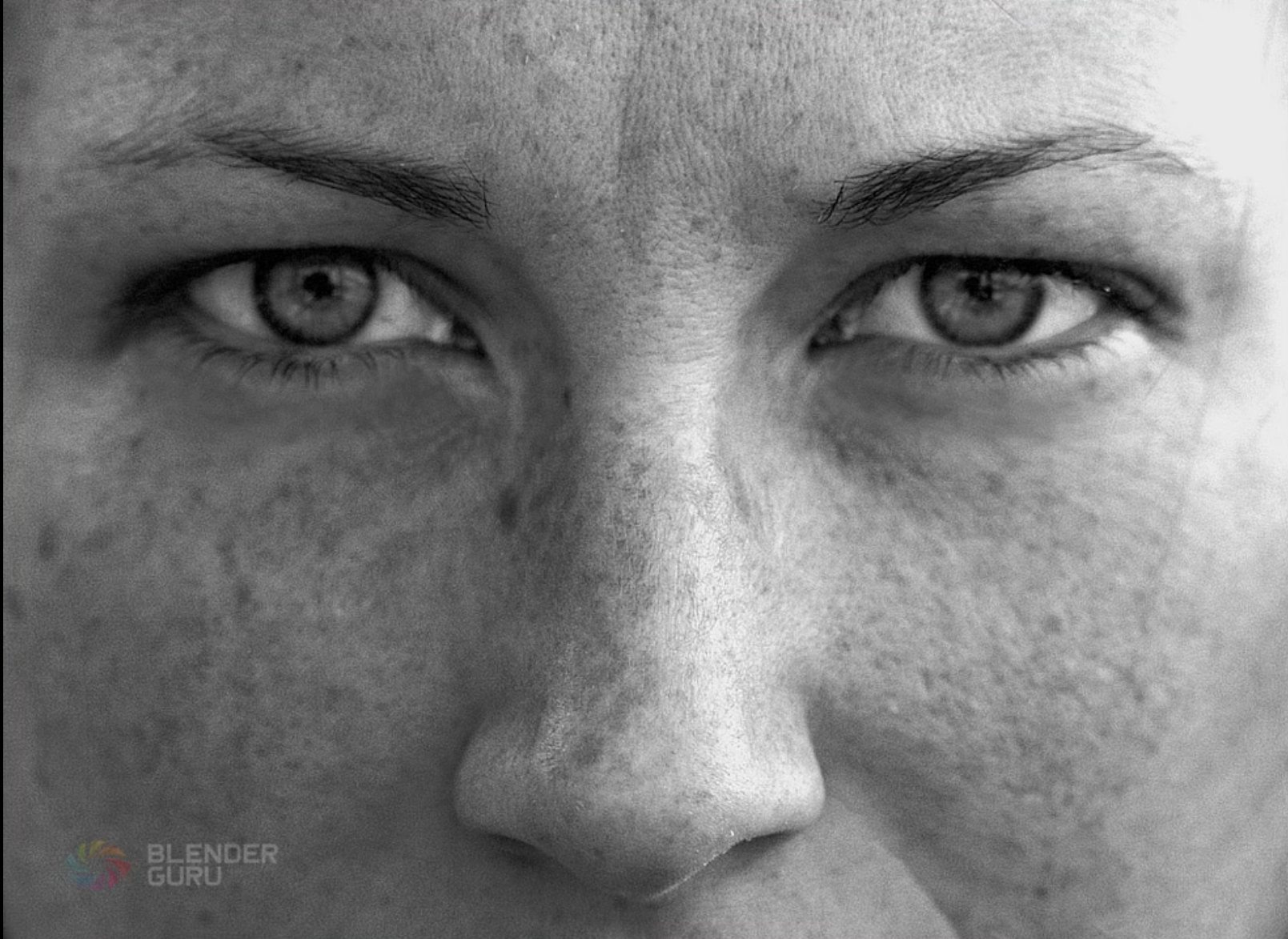
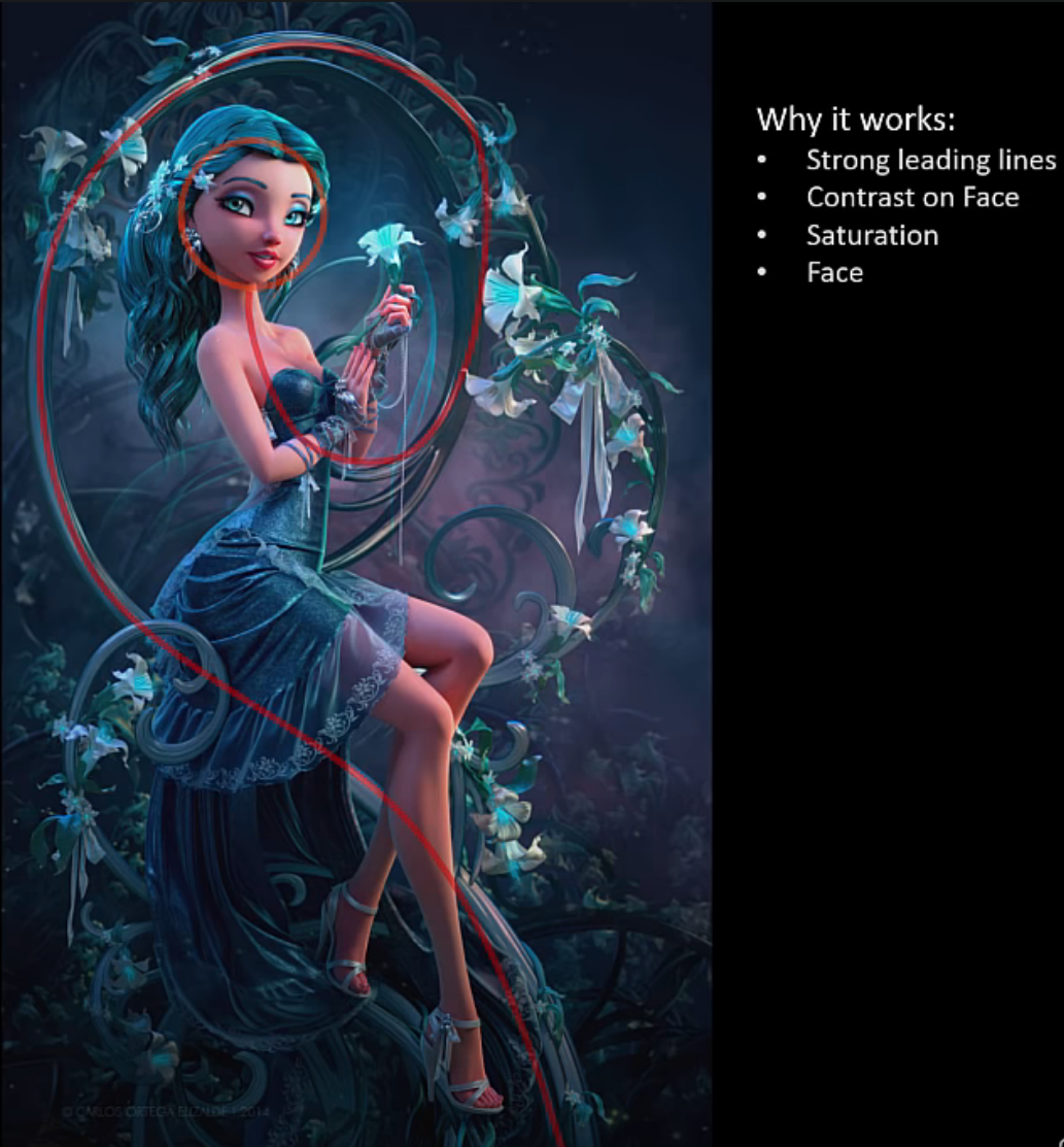
- Faces and Figures
- Geometric Shapes
Other Elements and Emphasis Examples
Understanding composition (videos)
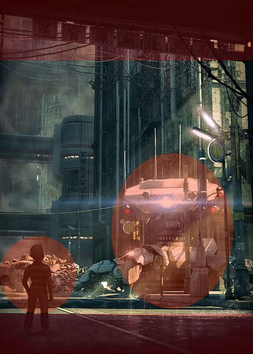
Color, Saturation and Contrast
Bolder colors for more important things and duller, muted color for less important things. If the entire piece is very dark, then lighter colors will pull focus, and when it’s very light, darker colors will draw a viewer’s attention towards them.
Placement of Key Elements
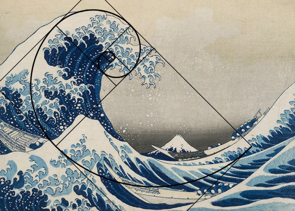
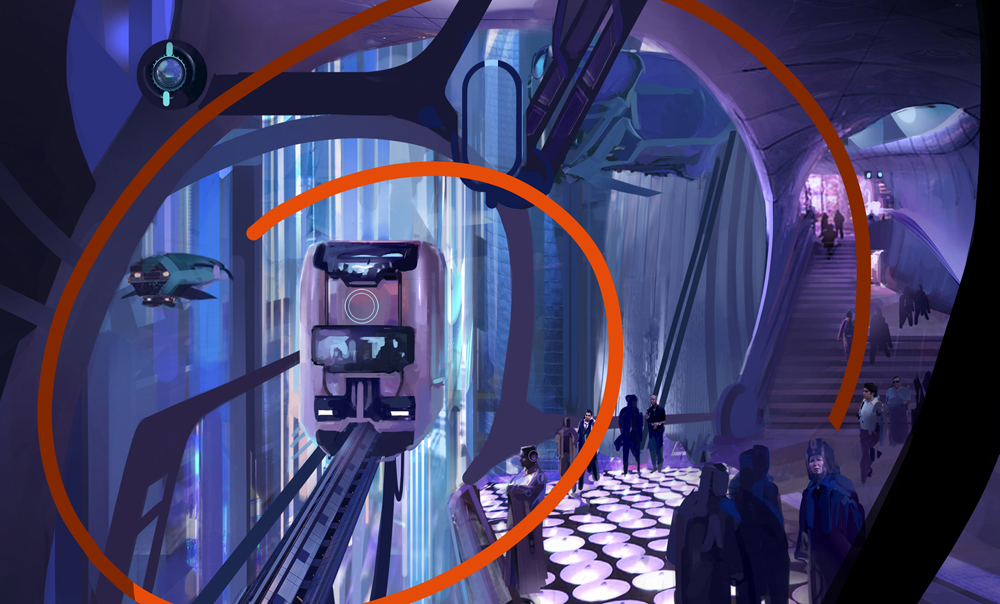
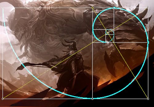
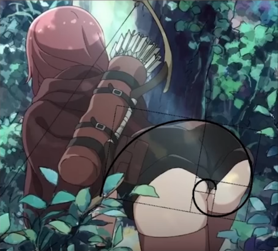
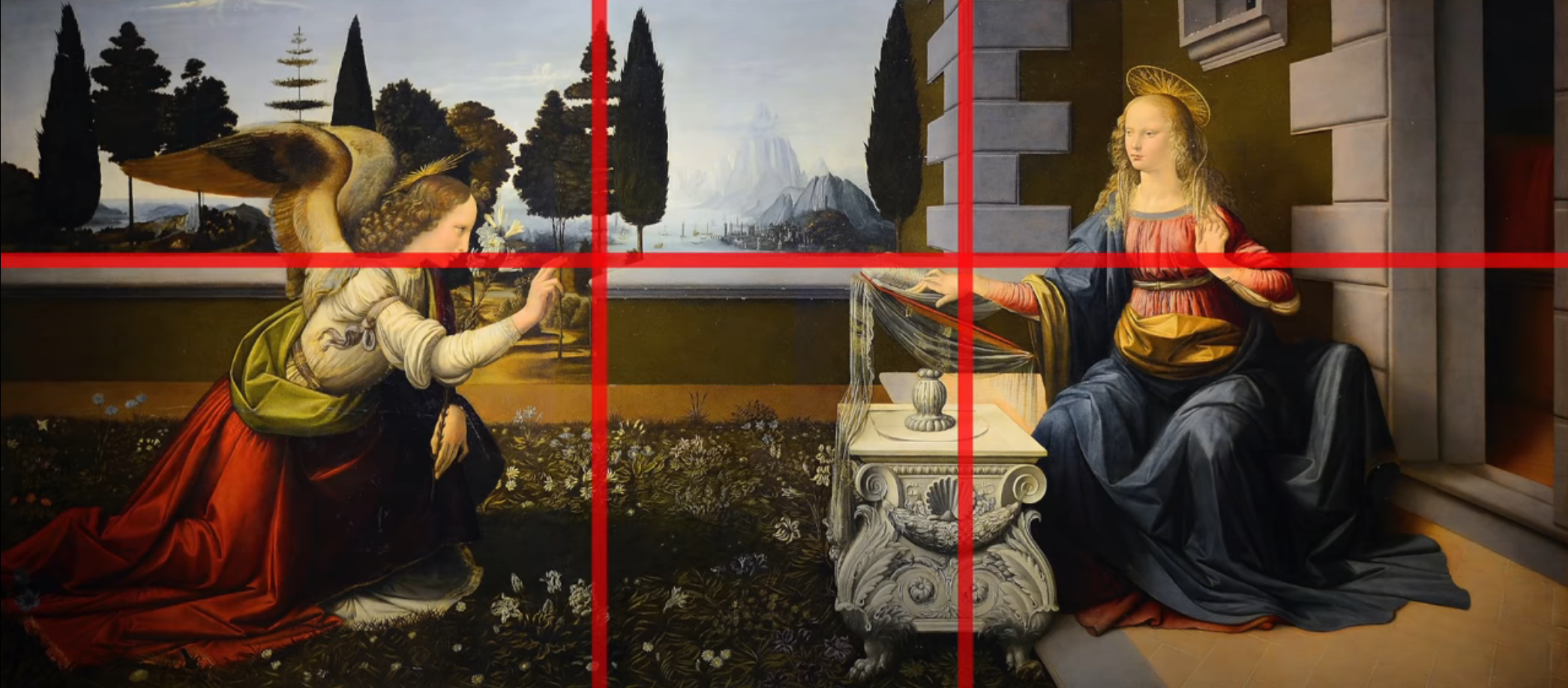
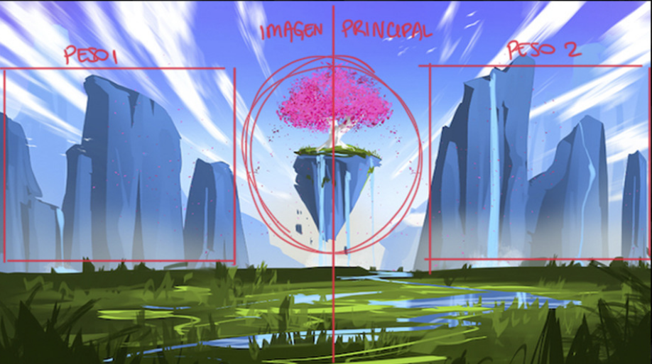
Golden Ratio
The golden ratio, also known as the golden mean or the Fibonacci sequence can be achieved by placing the key elements in the “eye of the storm”. To achieve this, the frame is recursively split with a ratio of 1 to 1.68.
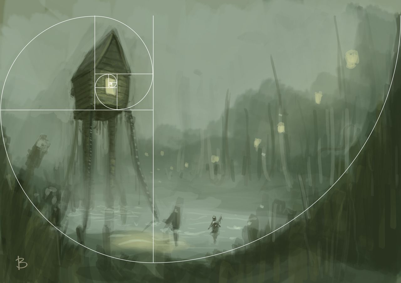
Other Golden Ratio examples
And one more for laughs
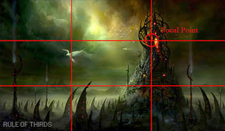
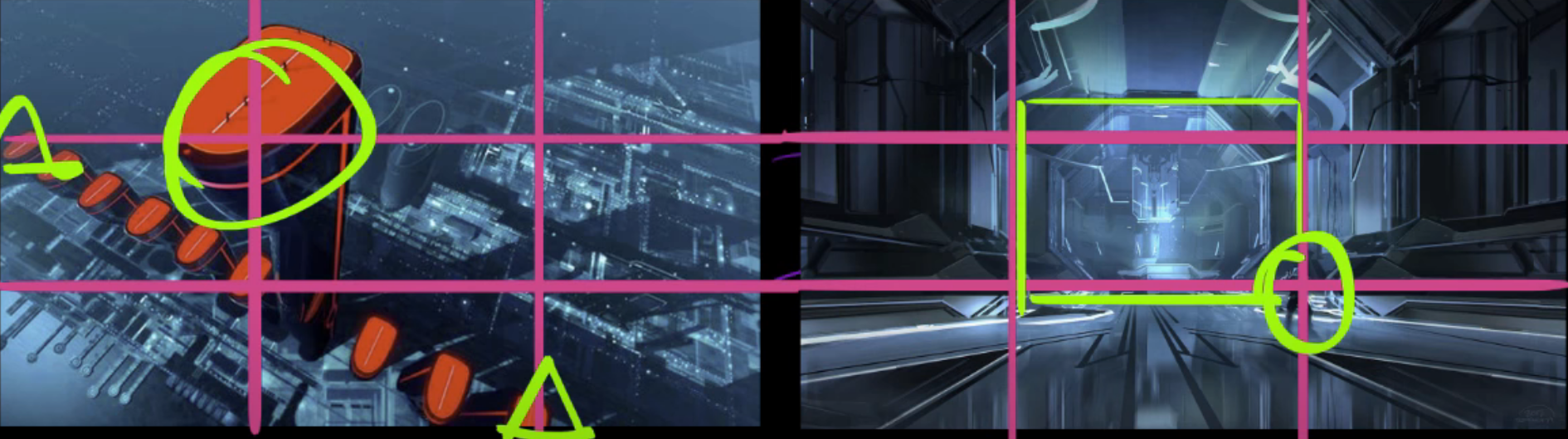
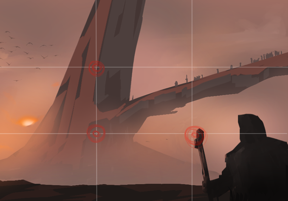
Rule of Thirds
The rule of thirds isn’t just used to place important points, but also to determine other things like:
The rule of thirds can be used to determine a number of artistic decisions:
- Surfaces where light hits vs. shadows
- How much skin of the character should be revealed
- The ratio between shiny and matte materials
- The ratio of one color vs. another color
- Where to place key elements
1/3 stands out more than the 2/3.
Other Rule of Thirds examples
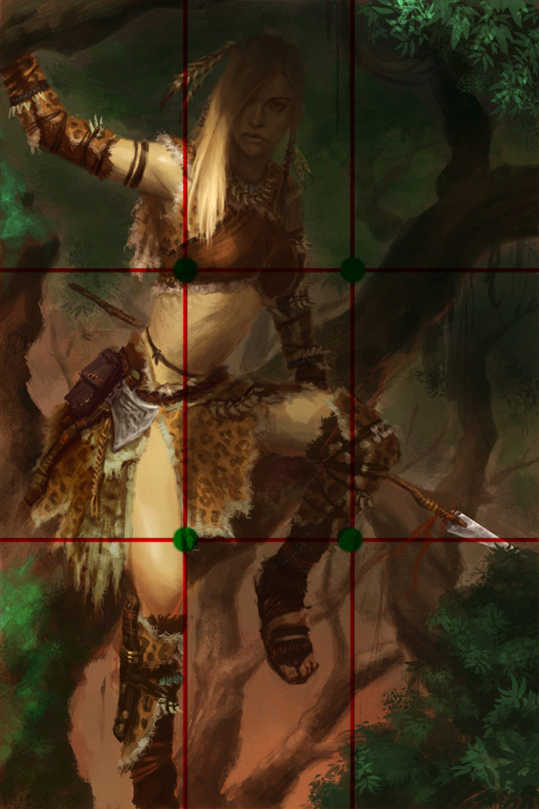
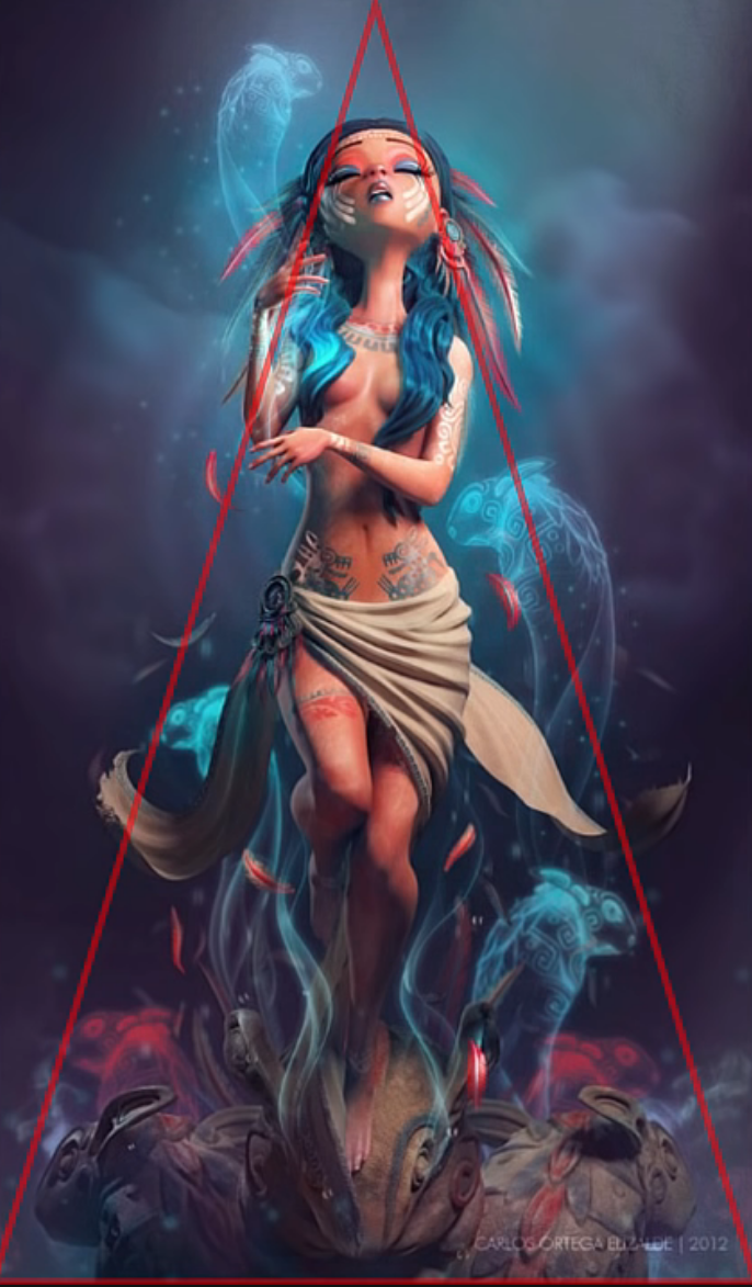
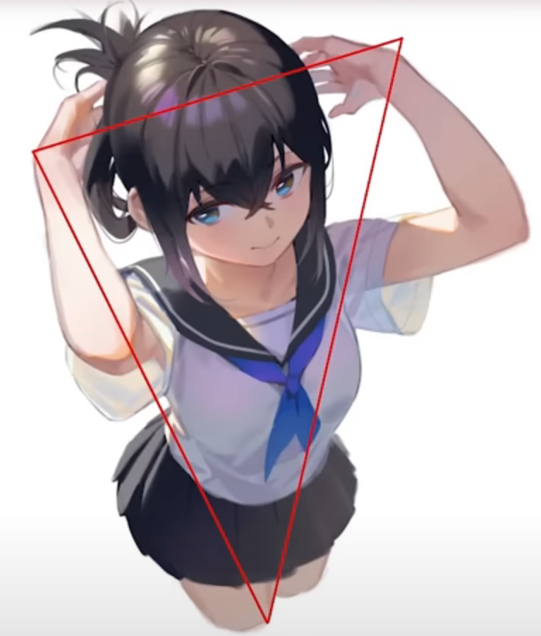
Triangle / Pyramid
This composition method is good for character shots.
Other Triangle examples
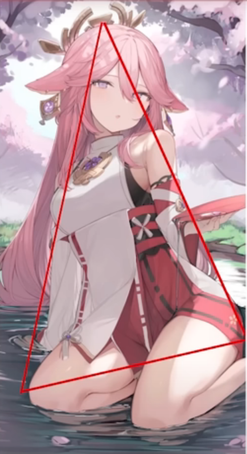
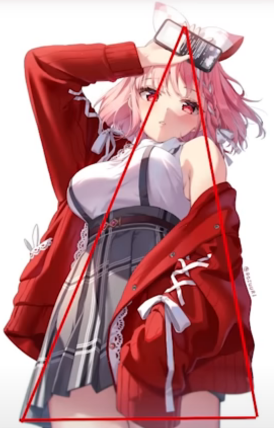
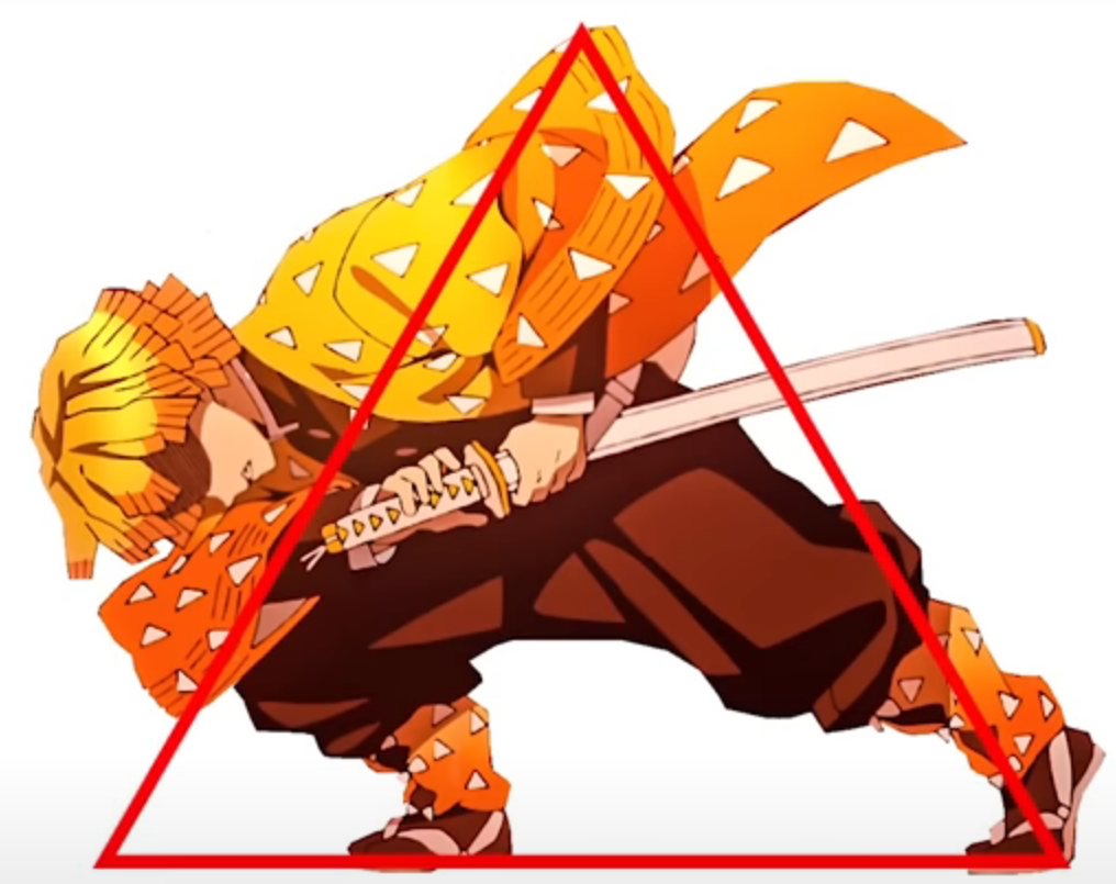
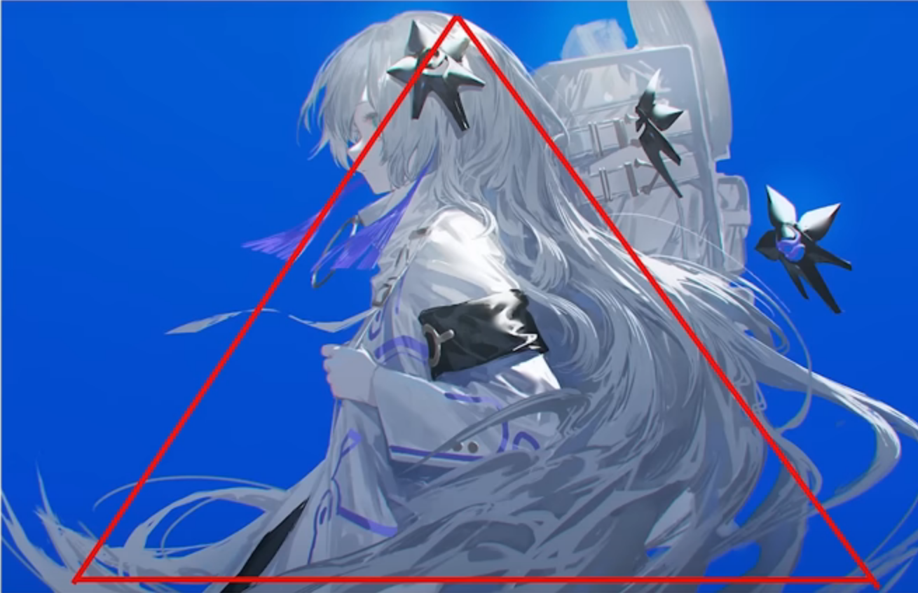
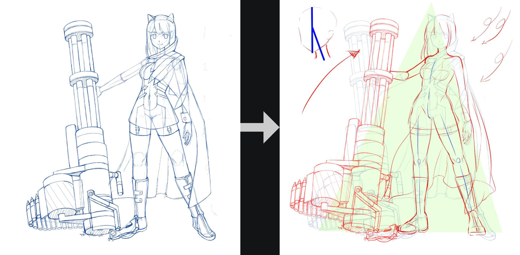
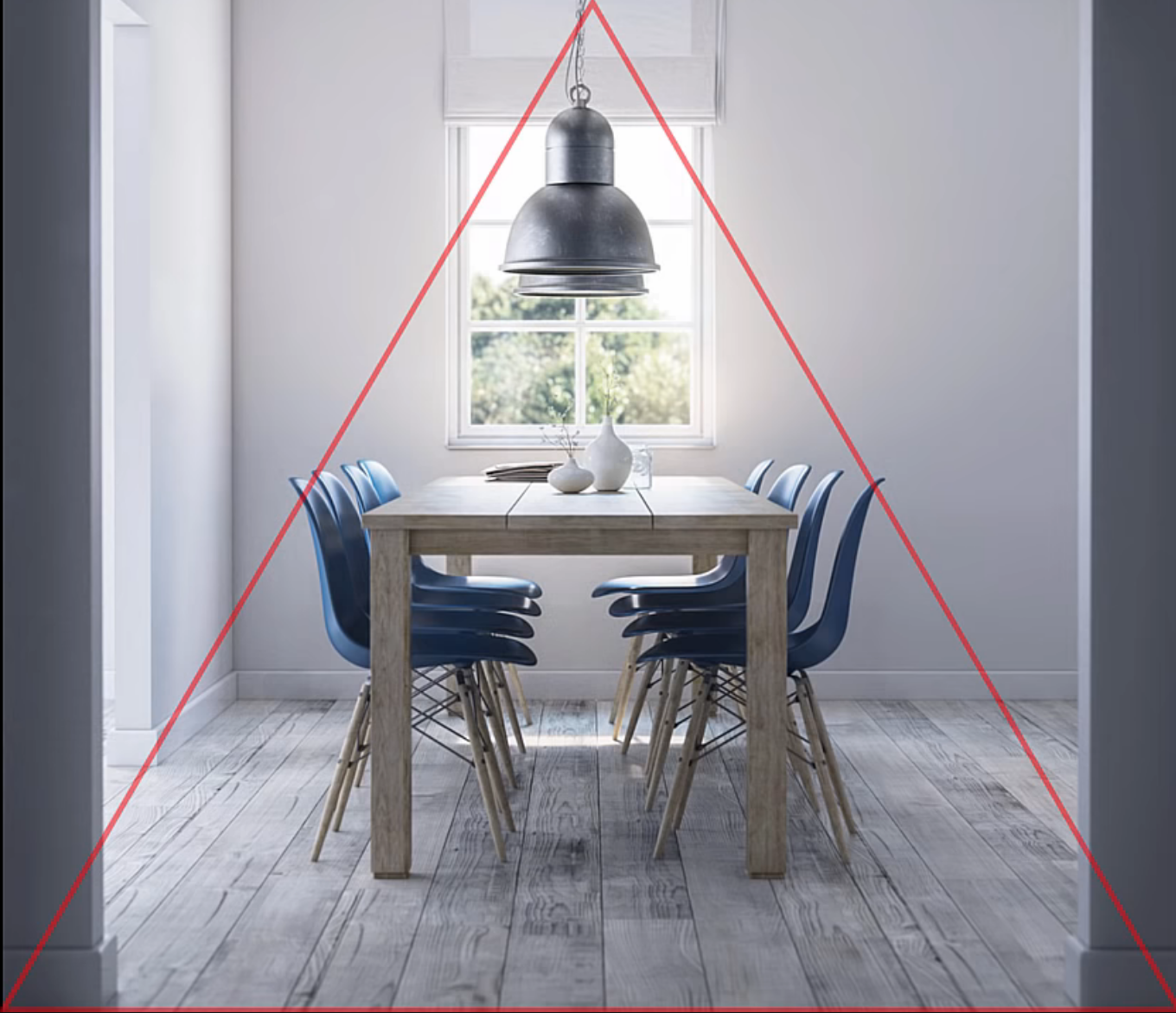
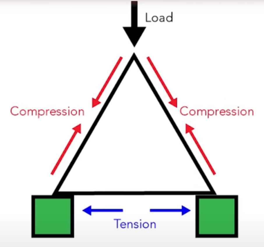
One reason why the triangle is a good composition method, is because it’s a sturdy shape:
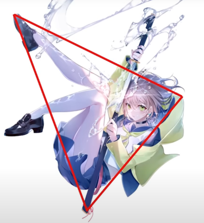
Flipped Triangle
The flipped triangle is a more dynamic version of the triangle composition; it can also be tilted to become a bit more interesting.
Other Flipped Triangle examples
Symmetry
Good to signal power, of a building for example. Symmetry line can be anywhere.
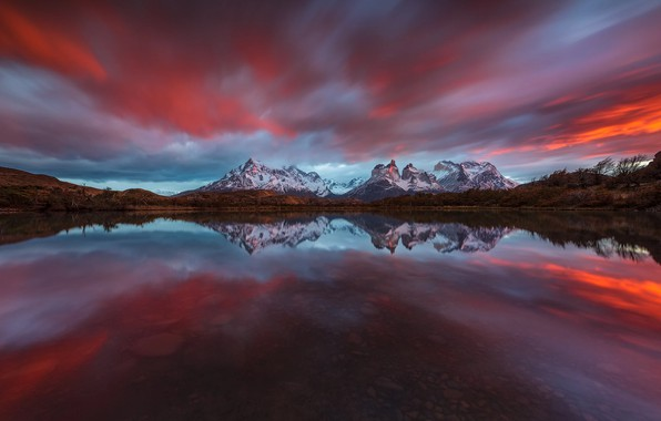
Symmetry signals power and dominance. This is prominently used in buildings, monuments, and nature. The line of symmetry can be anywhere.
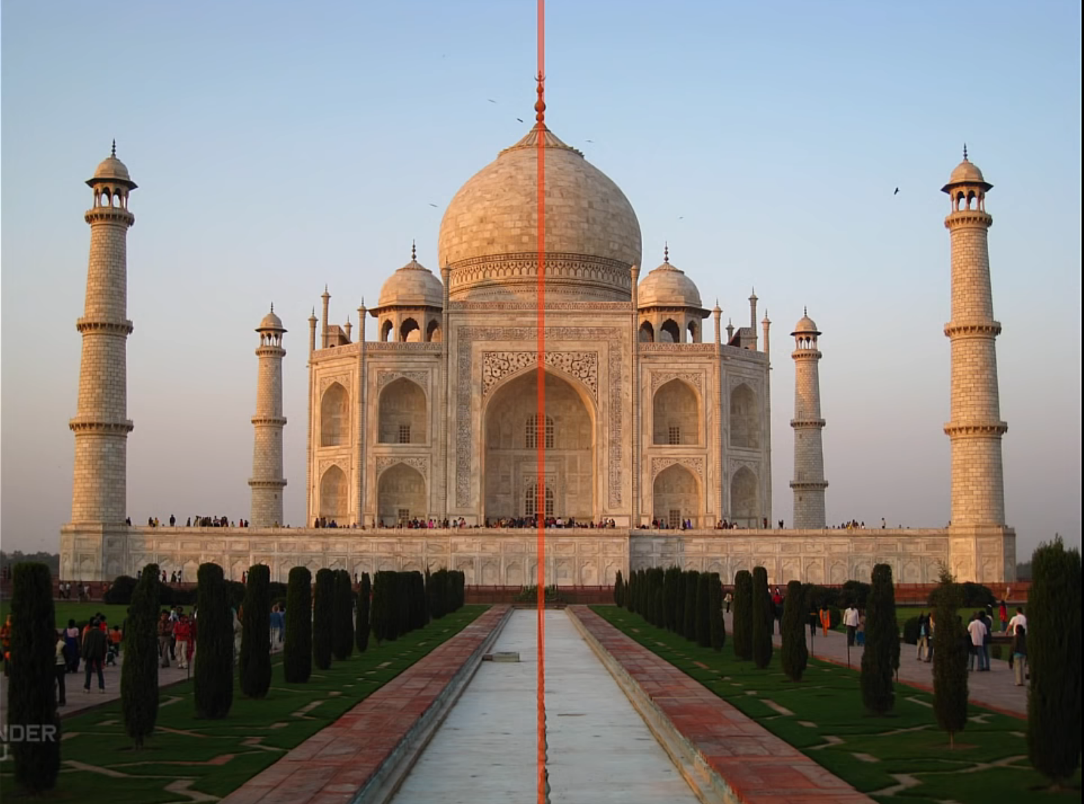
Other Symmetry examples
Full Frame
Is a composition type primarily used for characters and creatures. A great thing about it, is that it can be achieved with basically every finished piece by cropping the sides and doing some small tweaks. Nonetheless, it’s better to prepare for a full frame composition from the beginning, rather than as an afterthought.
Other Full Frame examples


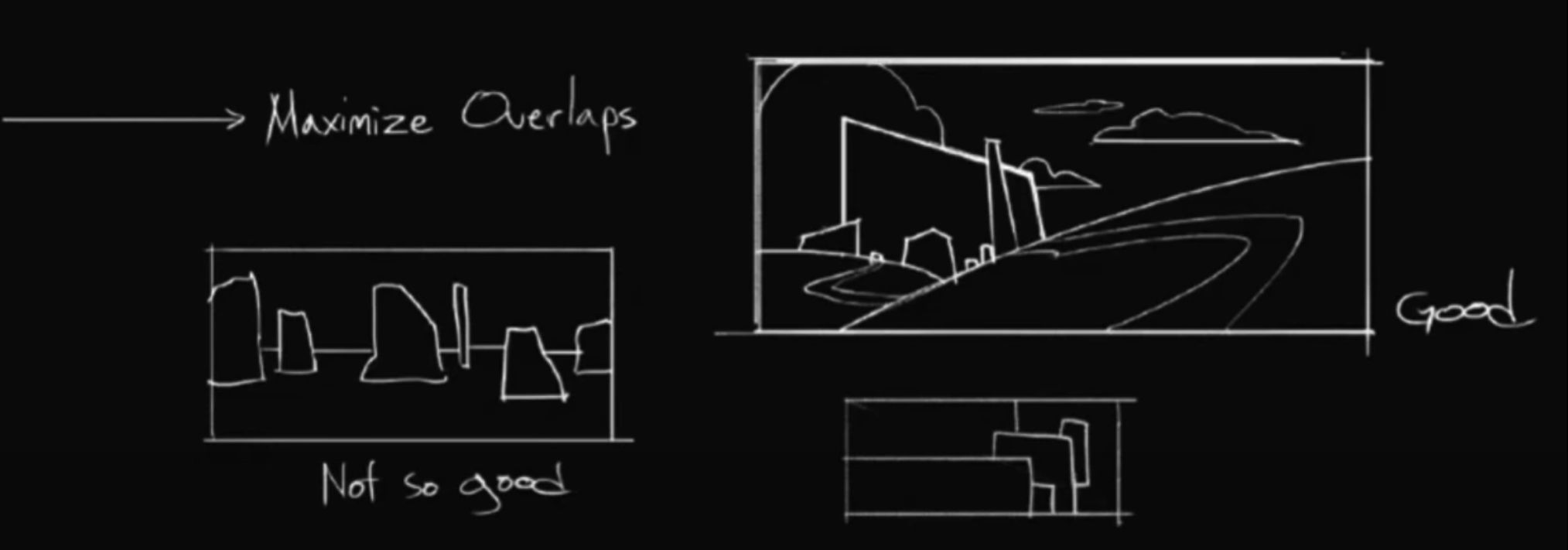
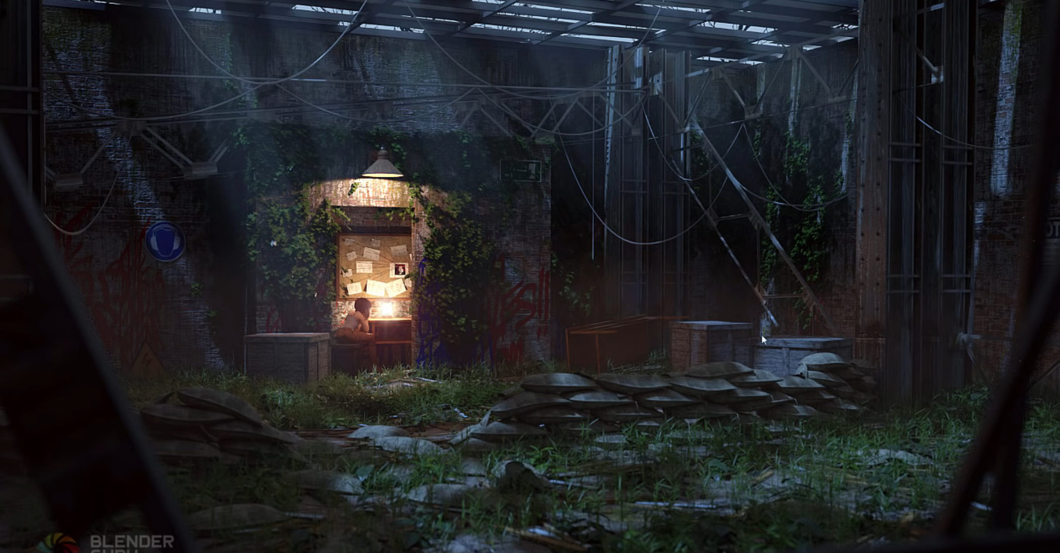
Negative Space
Positive space is a subject or point of interest and negative space is the surrounding area. More negative space gives the artwork space to breathe, while less negative space makes it more claustrophobic. Both can be good or bad, depending on what kind of mood the artwork should convey.
- To-Do: Examples
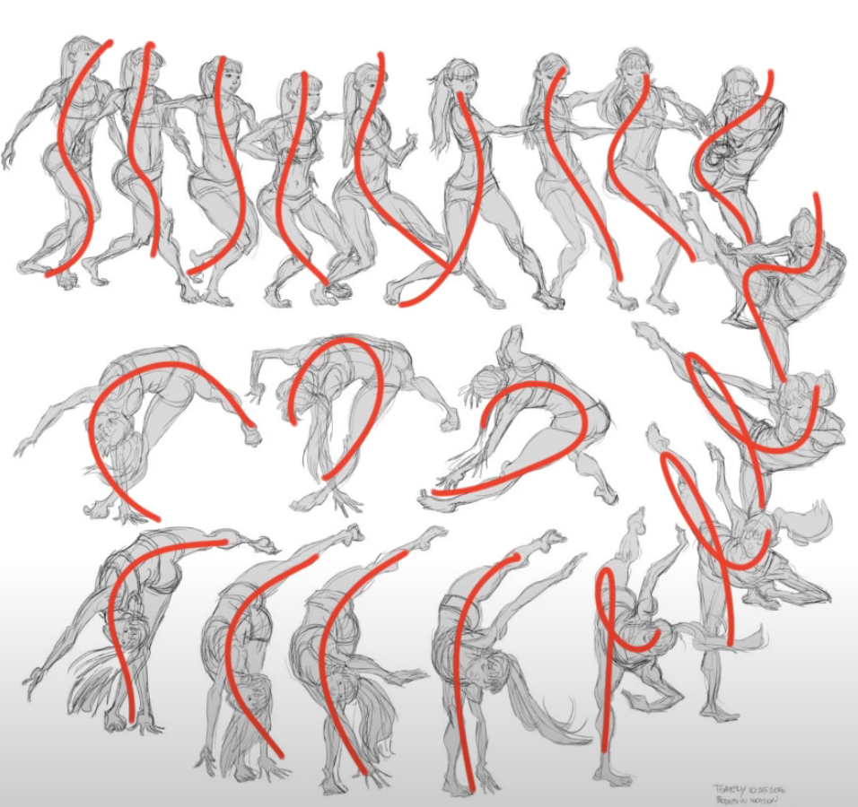
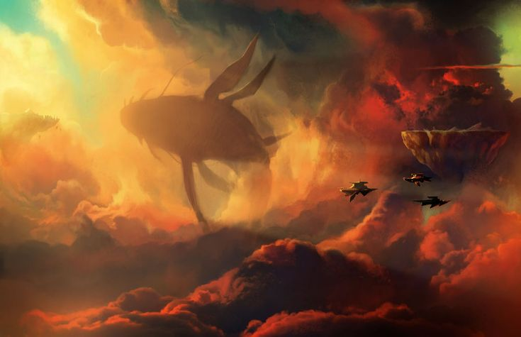
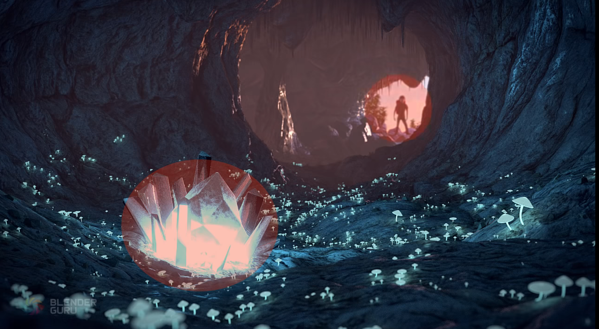
Energy Lines
They are found in a character’s pose; however, they can also appear in the environment, like in rivers and roads, for instance.
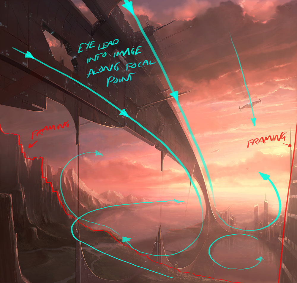
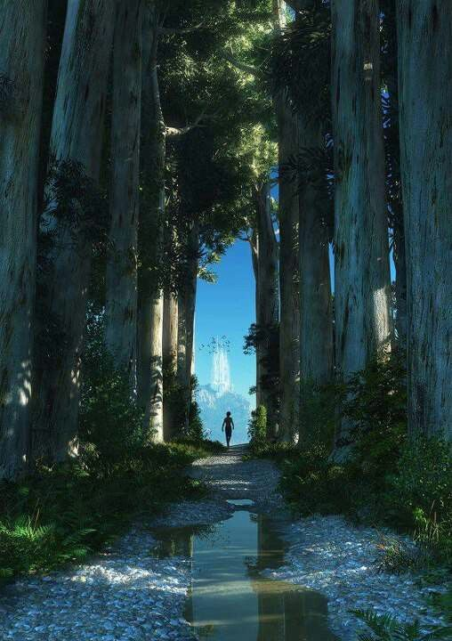
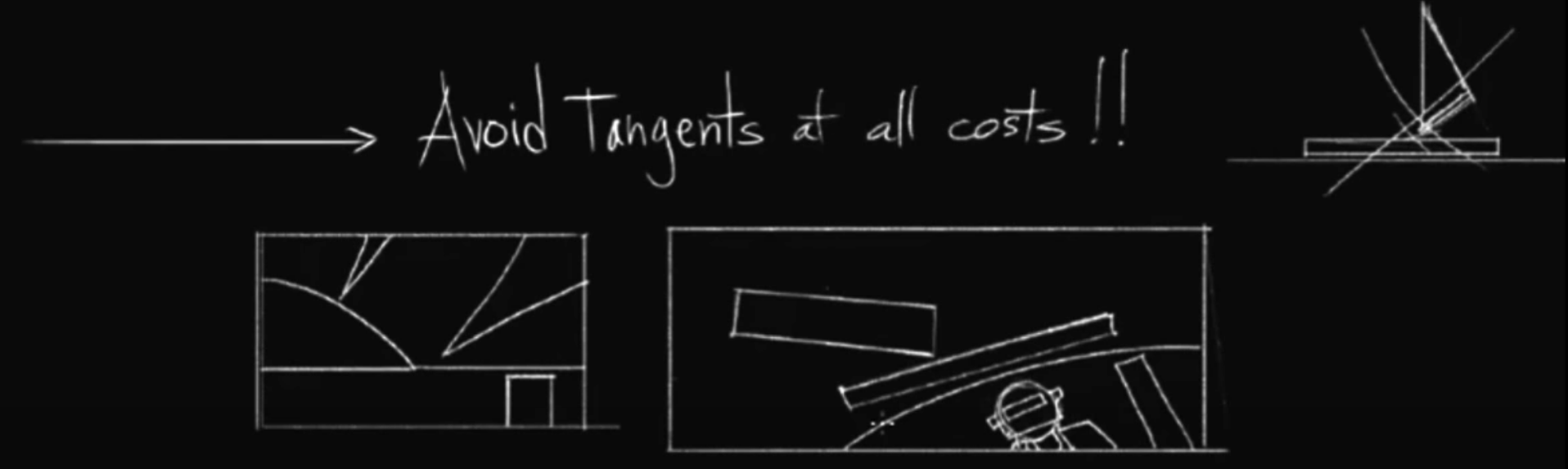
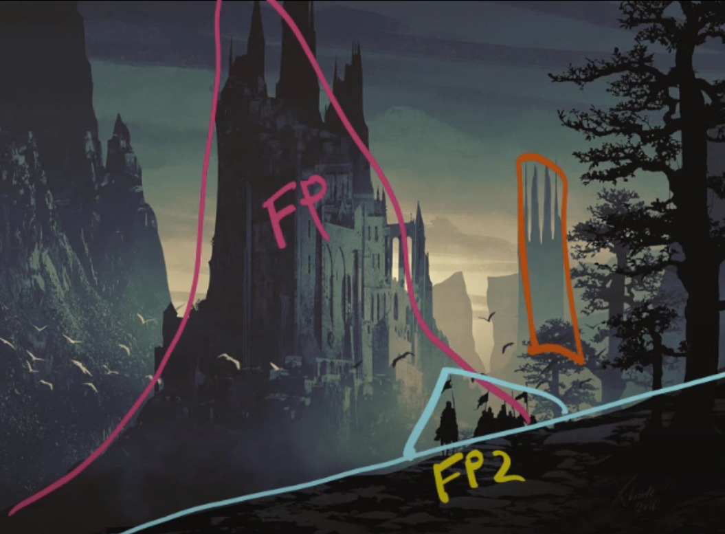
Guiding Lines
Guiding lines pull the eye along a path toward a specific position; when correctly deployed, they can encourage the viewer’s eye to travel around the image the way the artist envisioned. An all-time favorite is open umbrellas because they so nicely guide the eye back into the artwork with their arch and can be held at any angle.
Other Guiding Line examples
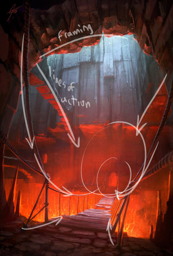
Framing
Framing can be achieved through the following elements:
- Vignettes
- Big windows
- Openings to the sky among dense buildings
- Dense trees at the left and right leading to a point in the middle
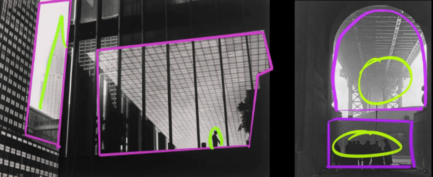
Other Framing examples
Other Elements and Emphasis Examples
Other elements / emphasis examples
Bad Examples
Bad examples

Balance
Some elements in an image create weight and need to be balanced by other elements.
Elements that create weight:
- Colors, saturation, and contrasts
- Size
- Faces and figures
A way to find unbalanced points, is to turn up the contrast and blur.
As illustrated by the example below, the presence of only one big light on the left makes the image very unbalanced:
In contrast, here’s an example of how to balance an image properly:
Positioning and Movement Direction
Moving to the left / right or forward / backward, and so on, can portray different things in an image or animation, like emotion, intent, and power. (This can also apply to the direction in which the character is facing.)
Positioning and movement direction (videos, articles)
Left / Right
-
Moving from left to
RIGHT: Progression Of Time, Progress, Normality, To The Action (Example: Soldiers running into battle to the right) -
Moving from right to
LEFT: Moving Back In Time, Regression, Abnormality, Back To Safety (Example: Soldiers carrying wounded to the left) -
Rightside of the screen: Good, Positive -
Leftside of the screen: Bad, Negative
Forward / Backward
- Moving
Forward/Towardsthe Camera`: Power, Domination/ Dominance, Aggression - Moving
Backward/Awayfrom the Camera: Weakness
Top / Bottom
- Moving
Up/ being at theTop/ beinglooked upat: Dominance, Power - Moving
Down/ being at theBottom/looking downon: Weak
Some Other Interesting Examples
- Most languages read from left to right
- Books begin at the left and end at the right
- Evolution images show evolution starting at the left
- In most platformers, one starts on the left and moves to the right of the map
- On graphs time increases as one moves to the right
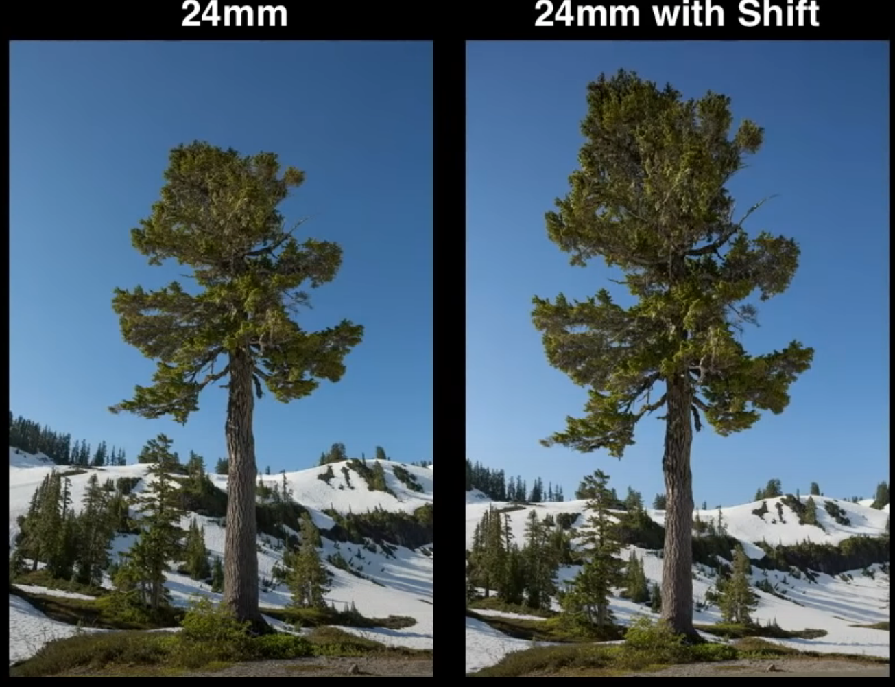
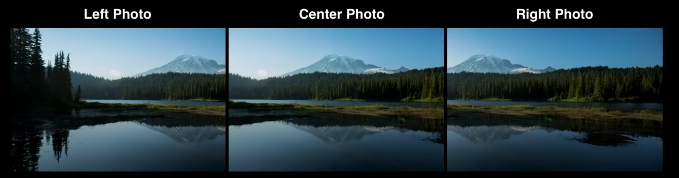
Tilt Shift Camera
Tilt shift is used to get straight lines in renders / photographs and for panoramas. It’s mainly used in architectural contexts. It can also be employed in compositing, but that’s a worst-case scenario. To achieve this, the camera should optimally be at an 90° angle, then one changes the shift amount on the desired axis. (In Blender, this is in the camera tab.)
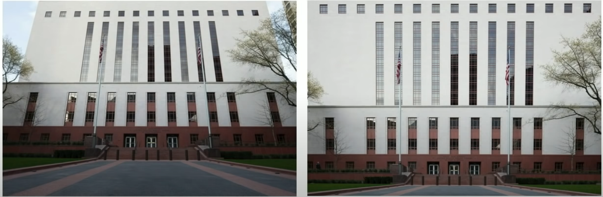
Other Tilt Shift Examples

Tilt shift (videos)